2012 LOGO TRENDS
May 17, 2012
Trends are constantly evolving at a rapid rate in our modern world– from color to fashion, vehicles, music, and television, it can be difficult to keep up! Design trends are no different—but the goal is to fit in with the trends, while maintaining originality.
Below are some great examples of the 2012 logo trends that I found on logolounge.com. I hope you’ll find them as inspiring as I do!
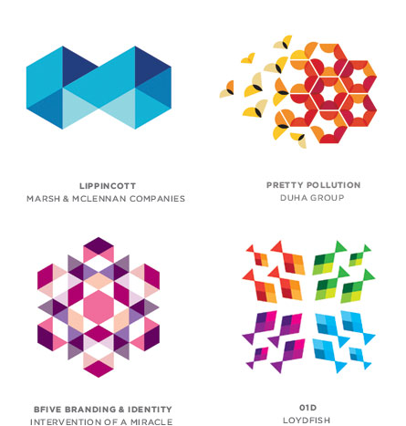
Tessellation
Multiple geometric shapes are gathered in a series to cover an area with a repeatable pattern. Often the individual components share a common color palette that creates the effect of overlaps and transparency.
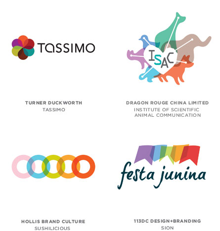
Transparent Links
Demonstrating strength in numbers by constructing a logo from multiple elements is a long-standing formula. Linking these elements together in a transparent chain-like fashion is new, however. Color is used to demonstrate variety in these samples, and proof of connectivity is demonstrated by tonal shift where elements overlap.
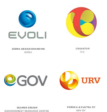
Sphere Carving
Here a sphere is meticulously carved away, creating a series of delicate, lace-like balls nested inside of each other. It is the idea of taking an orb with obvious highlights and shadows and tooling out enough of the element to create a secondary level of meaning.
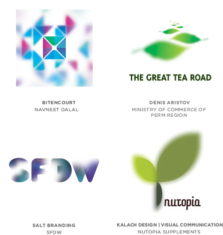
Selective Focus
You may be familiar with this concept of creating “depth of field” more so in photography but with our advancements in technology, we’re now able to create this interesting look for print pieces as well. The subtle misty qualities of these logos can create an entrancing effect as the soft edges of the mark seem to vanish into the surface.
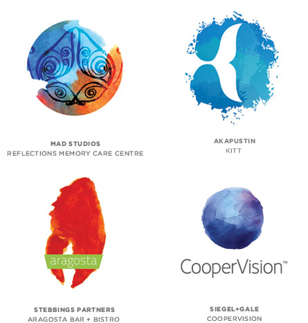
Watercolor
This is an example of one trend that does its best to build a bridge away from technology and back to the human touch. More than just a textured background, this painting technique usually defines the logo’s shape, form, and highlights as well.
These are a few of my favorites, but there are a handful of other options that you can view at logolounge.com .
