A GREAT REBRANDING
April 24, 2013
Many brands that are fortunate enough to have longevity, find themselves in need of a facelift or rebrand every 5 – 10 years or so. The reasons are varied– sometimes it’s because the company has changed direction or focus; other times it might just be a need for a modern refresh to an outdated look and feel. Take a look below at what I consider to be a powerful example of “Before + After” rebranding.
I absolutely love the new color pallet and the choice of graphics over outdated photography.
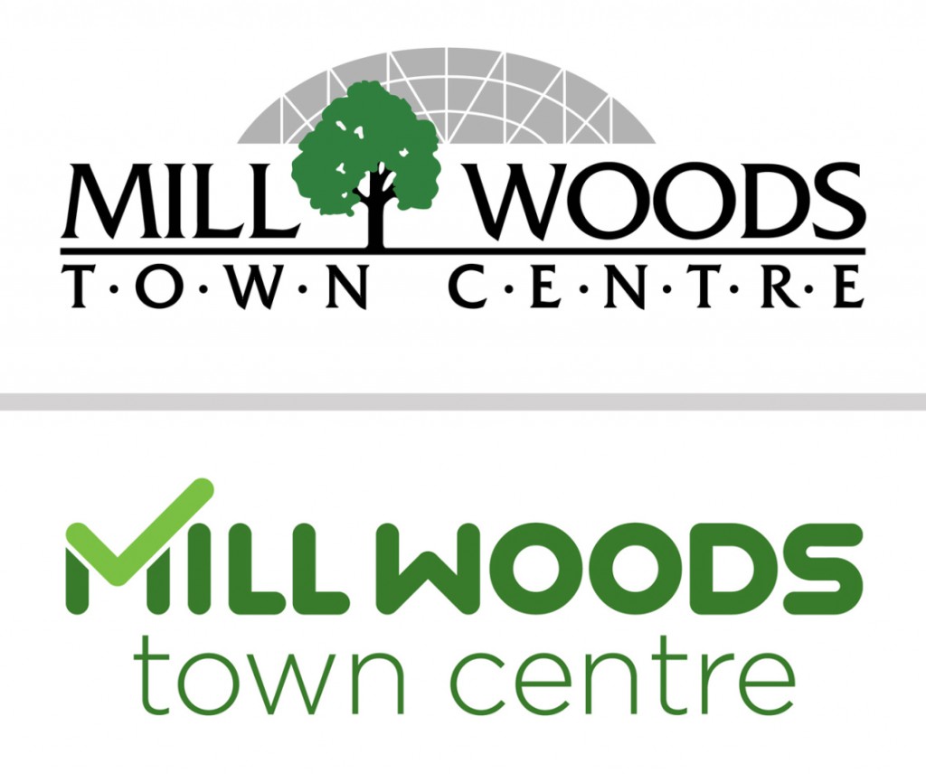
A modern new logo, with clean lines and a rounded typeface:
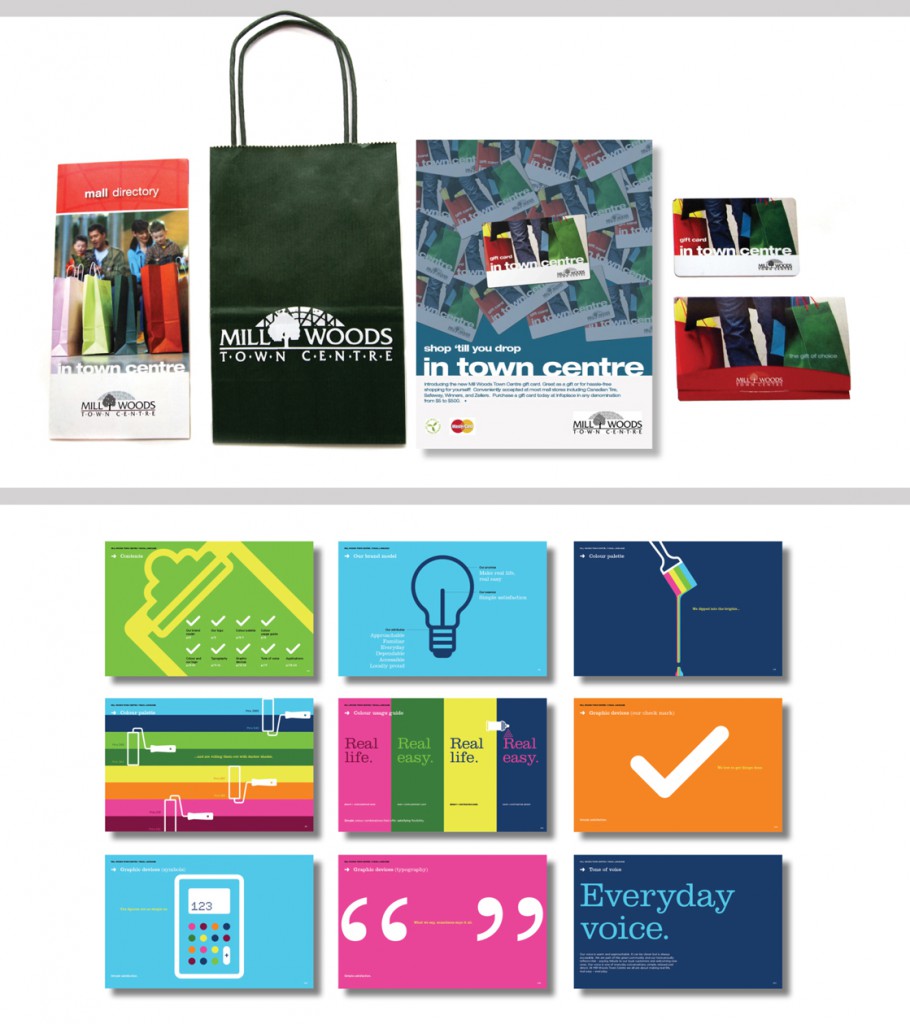
Their printed materials have been updated with vibrant colors, a creative graphic treatment and simple copy to convey the message quickly:
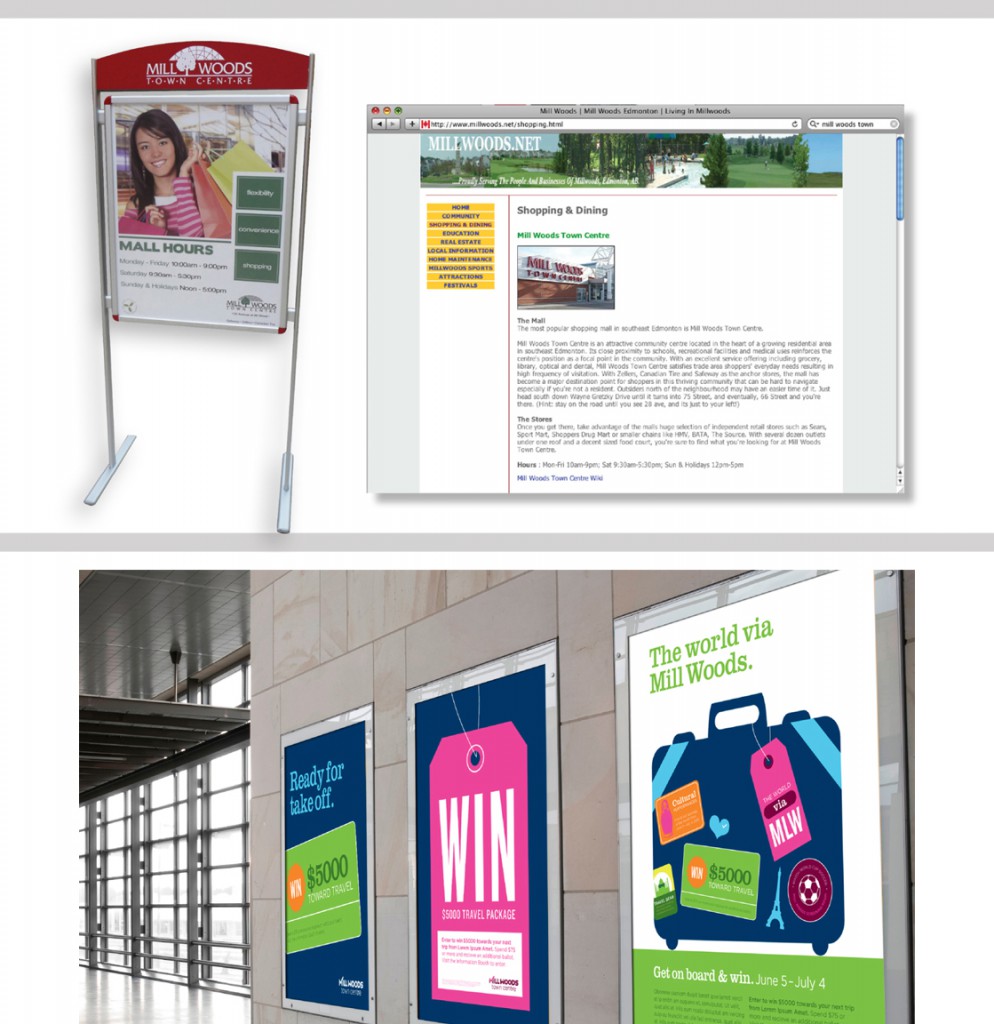
Mill Woods’ revised ad campaign literally grabs visual attention with bold graphics:
If your company’s visual identity is similar to the “before” examples… please call us so we can help modernize your brand with a new facelift!


